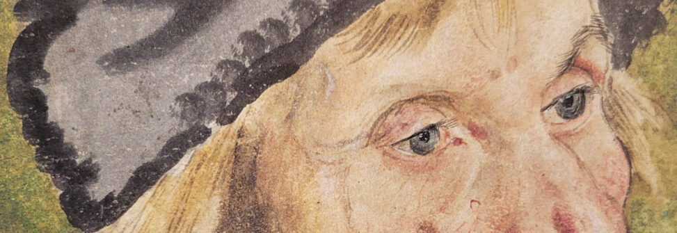
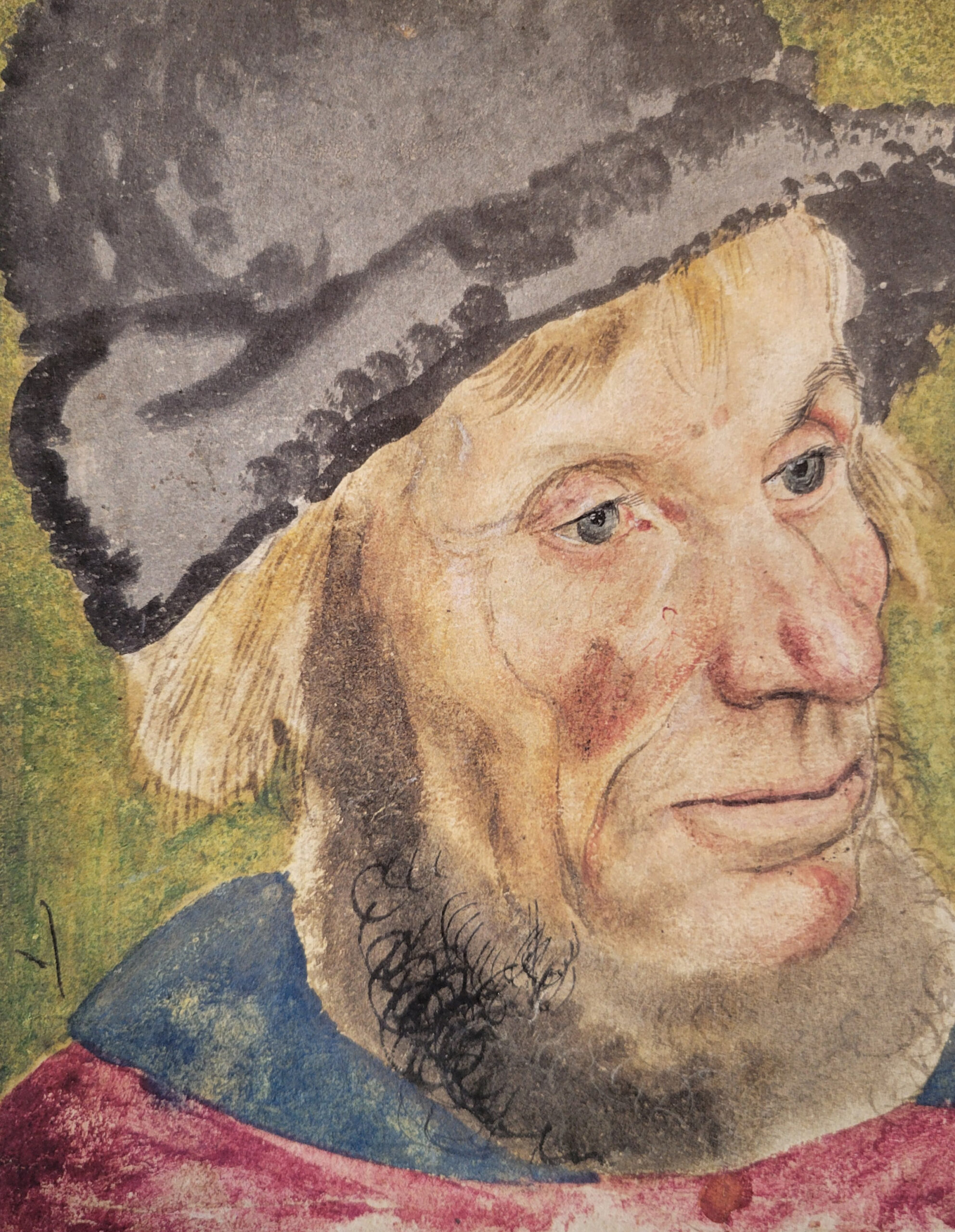
The image above, by Lucas Cranach the Elder, features red, green, yellow, and blue colors. These colors were favored by Renaissance artists partly as a result of the pigments available to them, but also for theoretical reasons, as we shall see in a moment.
If you are like most people, you learned at a young age that there are three primary colors — blue, red, and yellow — from which all other colors are mixed. You can think about color that way, but it’s worth realizing that there is nothing magical, inevitable, or scientific about that color triad.
In fact, it is difficult to mix colors using blue, red, and yellow, which is why printers (who use the same pigments in their dyes that painters use in their paints) quickly gravitated to replacing red with magenta, a kind of red violet color, and blue with cyan, a sort of green blue. (Bruce MacEvoy asserts that “red and blue cannot be primary colors” because of intrinsic deficiencies in their wavelengths.) Along with cyan and magenta, the four-color CMYK printing process uses yellow and black, called the “key.”

While it is easier to mix colors with magenta than with red, magenta is an “extra-spectral” color — it does not appear in the rainbow of hues produced by passing light through a spectrum. That is because it does not correspond to a single wavelength of light but is a product of the way the multiple cones in our eyes respond to and combine red and blue-violet light (light that contains no green).
It was Isaac Newton who, in a real stroke of genius, bent the spectrum into a circle, connecting one end to the other via the extra-spectral colors. The resulting hue circle has the advantage, as Newton realized, of representing complementary colors as opposite points on the circle.
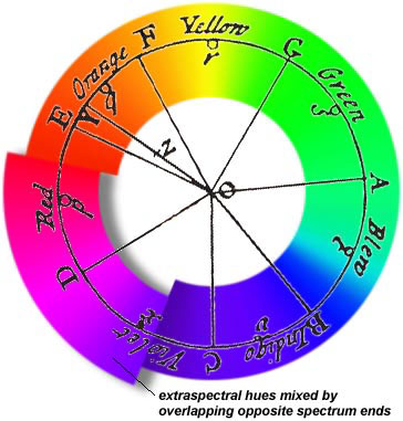
Artists were quick to recognize that Newton’s approach offered convenient guidance regarding color relationships, Newton’s breakthrough quickly caught on, and hue circles became commonplace, with hues related to the physical pigments used in producing colors.

Eventually artists and others who work with color developed a way of describing color that separates value (lightness/darkness) from chroma (saturation), and hue. Skipping over a couple of hundred years of experiment and argumentation (you’re welcome), we arrive at what is called CIELAB color, which Wikipedia describes as “a color space defined by the International Commission on Illumination (abbreviated CIE) in 1976. It expresses color as three values: L* for perceptual lightness and a* and b* for the four unique colors of human vision: red, green, blue and yellow.” This way of viewing color is based on the theory that we perceive color by processing signals from photoreceptor cells in an antagonistic manner (a theory first proposed in 1892 by the German physiologist Ewald Hering).


Regardless of which mode one selects when editing images in Photoshop or similar image-editing programs, when we adjust temperature and tint we are manipulating the image based on a four-color concept.
Which returns us to the Renaissance, where we began. In his Treatise on Painting (Trattato della peintura, a collection of notes and journal entries), Leonardo proposed that there were six primary colors: black, white, yellow, green, blue, and red. Black and white determine what is now called value. The other four colors relate to the post-Aristotelian view of basic elements. Yellow was associated with earth, green with water, blue with sky, and red with fire. But as it turns out, we have come full (hue) circle. The blue, yellow, and red triad that became color dogma in the eighteenth and nineteenth centuries has given way, and the red, green, yellow, and blue of Renaissance art again dominate advanced color theory.